
Redesigning a legacy sales tool
Role
UX/UI Designer
Methodology
Double Diamond
Timing
One year
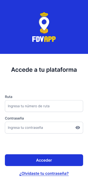
The FDV App is a mobile sales management tool designed for Plumrose Latinoamericana’s national sales team in Venezuela. It streamlines key sales operations such as order processing, collections, and inventory tracking, enabling sales representatives to provide more efficient and tailored service to their clients while meeting business targets.
The project emerged from two main challenges: the limitations of an externally managed legacy system that hindered product improvements, and an imminent change in the vendor’s pricing model that would significantly increase operational costs starting in 2025.
My role of Lead Designer in this project as a service provider working attached to the IT Department.
How do you redesign a legacy sales tool to improve performance and reduce long-term costs?
Phase 1: Discover
Stakeholder Interviews
We started by interviewing the stakeholders to kickoff the data gathering.

Miguel García
Our internal client, Miguel provided insight into the business motivations behind the project. The goal was to clarify why a new solution was needed, what limitations existed in the current tool, and what success would look like from a commercial perspective.
Key quotes:
“The team is constantly complaining about how unnecessary redundancy makes using the app time-consuming.”
“The order error-associated cost we are having with our current solution is too high.”
José Cuevas
As both IT lead and Product Manager, José outlined the functional requirements of the new solution and the technical constraints we needed to work within. He also coordinated user research activities and served as our main liaison with the internal teams.
Key quotes:
“We need something developed in close collaboration with our team to make it easier to keep improving down the line.”
“The current app has been built piece by piece over six years, but it stayed a module-based system—which now is a hindrance.”
Gregory Pestana
Gregory, responsible for SAP integrations, helped us understand the technical architecture and the non-negotiables in terms of system compatibility. His input shaped how we scoped the redesign while minimizing disruption to the existing infrastructure.
Key quotes:
“The SAP integration infrastructure is where most of the time has been invested—we have to keep as much of it as possible in place.”
“One of the main problems is that decisions have been made at a business level without taking the final user’s feedback into account.”
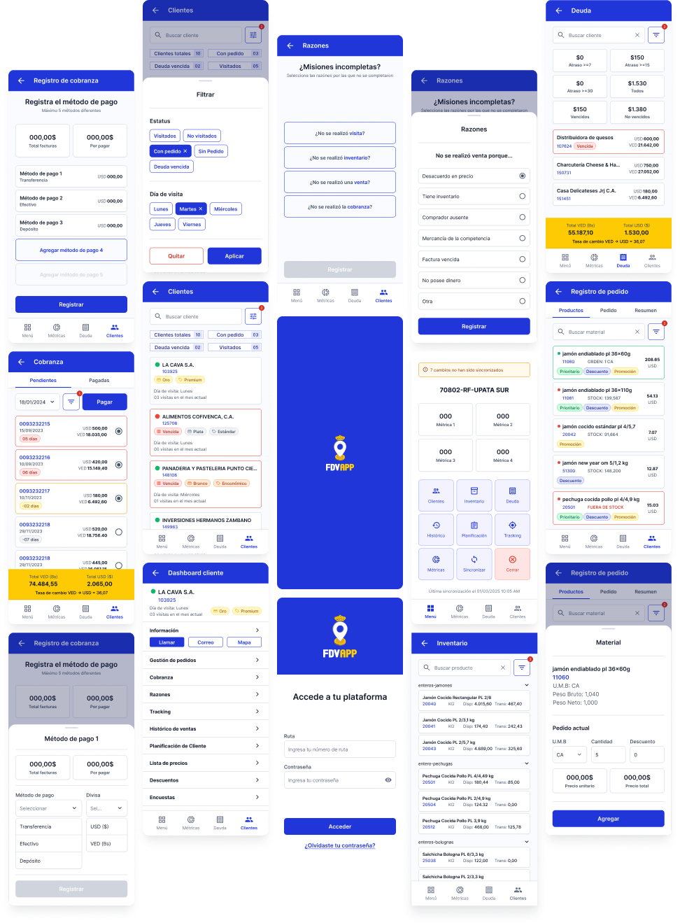
With this initial information I coordinated a Shadowing exercise with the users.
Shadowing
Supported by the local IT team, we shadowed three members of the sales team during a regular workday. With minimal intervention—only asking questions when we sensed frustration—we aimed to uncover pain points in the current application and understand how these issues affected the quality of service they provided to customers.
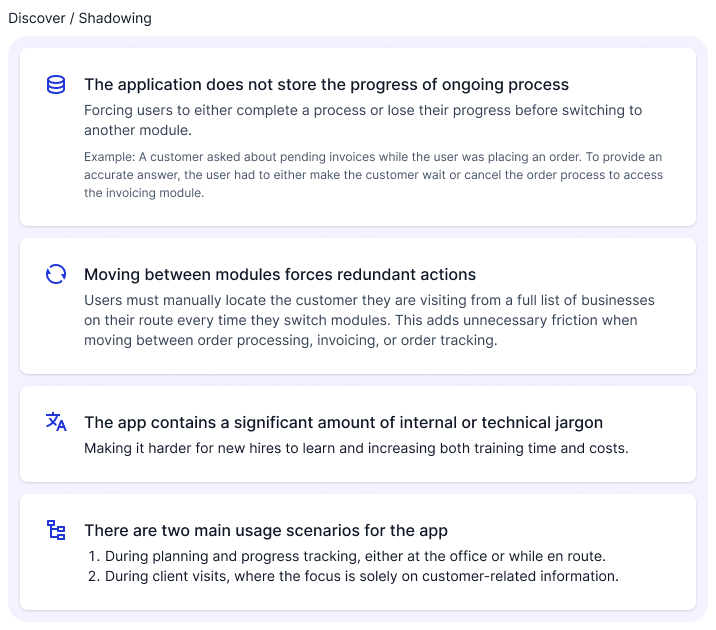
User survey
To validate our initial research findings and better understand pain points at scale, we conducted a survey of all 153 members of the national sales team.
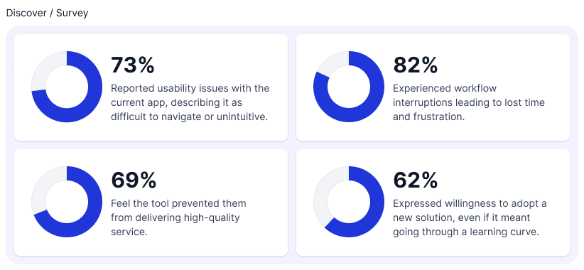
Lastly I conducted an Heuristic Evaluation of the tool to identify specific areas to improve.
Heuristic Evaluation
The following usability issues were identified through a heuristic evaluation of the existing application:
Phase 2: Define
Insights
I gathered all the information the team collected over the Discover phase and distilled to the insights we used as a guide moving forward.
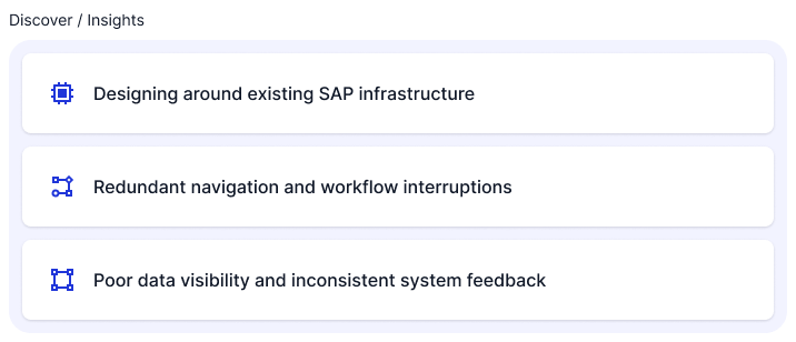
Designing around existing SAP infrastructure
One of the most critical constraints uncovered during stakeholder interviews was the need to preserve the existing SAP-based back-end. To avoid major disruptions and reduce development time, the new application had to integrate seamlessly with the current infrastructure—limiting how much we could alter the underlying architecture.
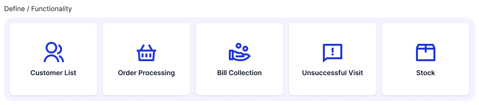
We prioritized redesigning only the most essential modules for the first iteration of the product. These core features formed the scope of a fully integrated MVP:
Redundant Navigation and Workflow Interruptions
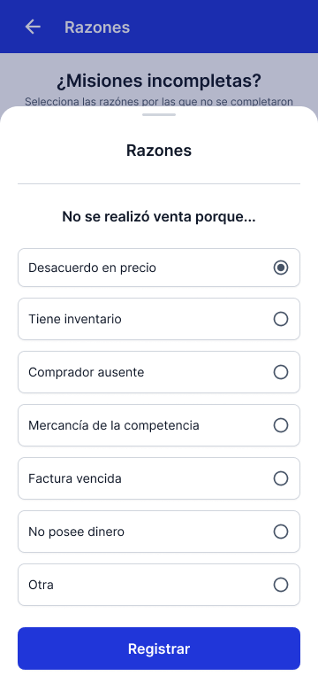
Through user observation and interviews, we identified a major friction point: the current app forces users to restart tasks or repeat actions when switching between modules, severely disrupting workflow continuity. This not only increases cognitive load but also leads to errors and inefficiencies in the field.
Poor Data Visibility and Inconsistent System Feedback
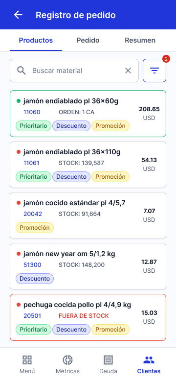
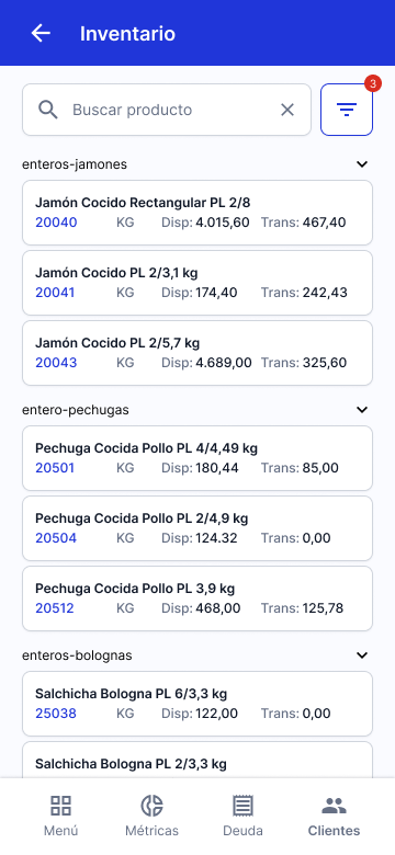
The existing user interface lacks clear feedback mechanisms, offers limited visibility into critical data (such as stock availability), and depends heavily on ambiguous iconography. These issues, combined with a cluttered layout and weak visual hierarchy, lead to preventable errors, slower task completion, and reduced user confidence.
Phase 3: Develop
With the project’s scope and challenges clearly defined, I moved on to developing the core building blocks of the new application.
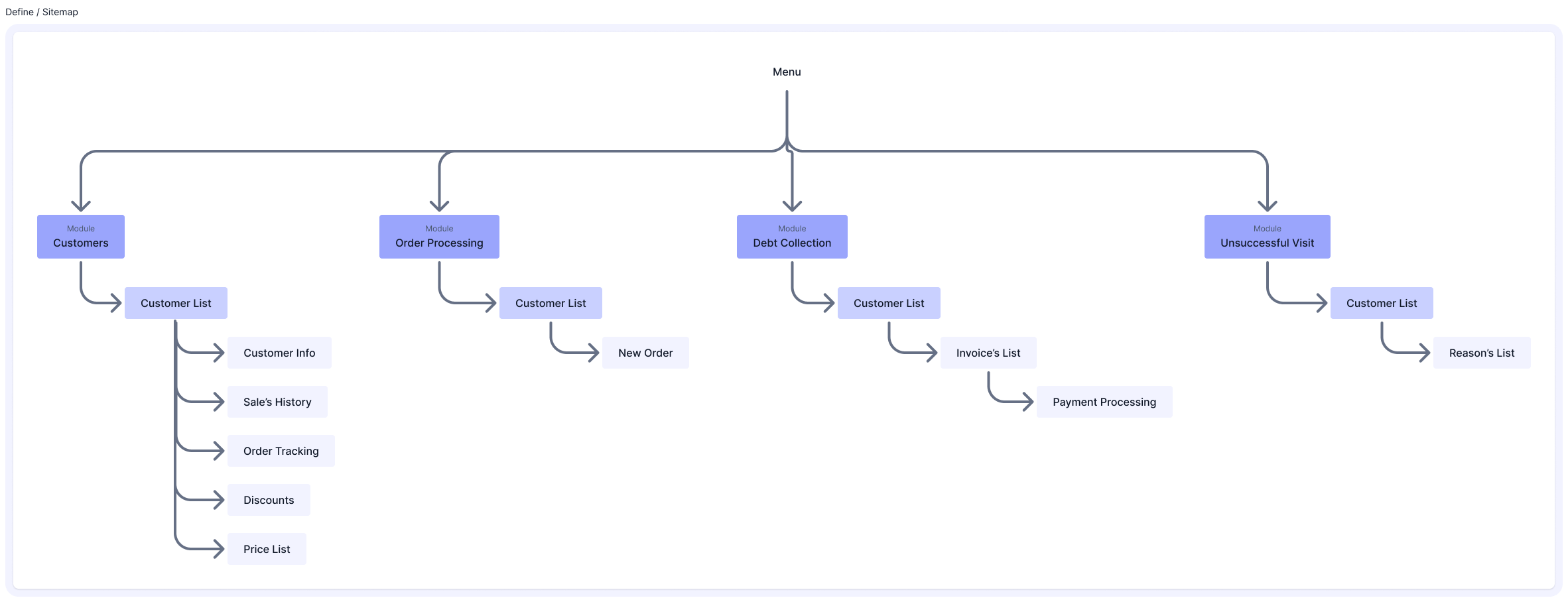
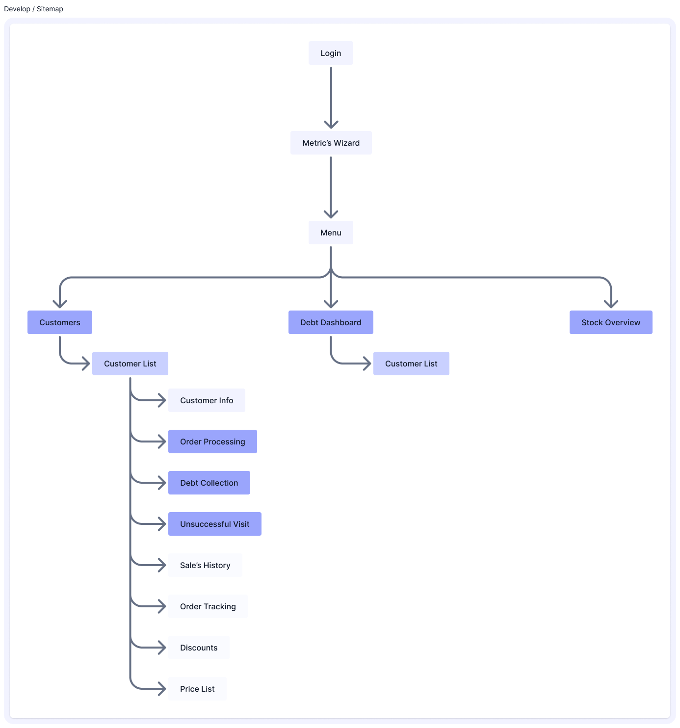
Sitemap
To address the workflow and navigation issues, I redesigned the app’s information architecture based on the two primary usage contexts identified earlier—planning/tracking and customer-facing interactions. The goal was to consolidate related features into unified flows, reducing the need to jump between modules. Key changes included:
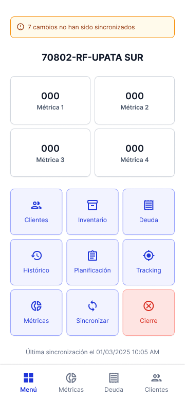
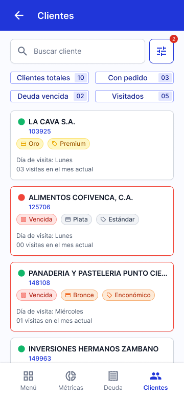
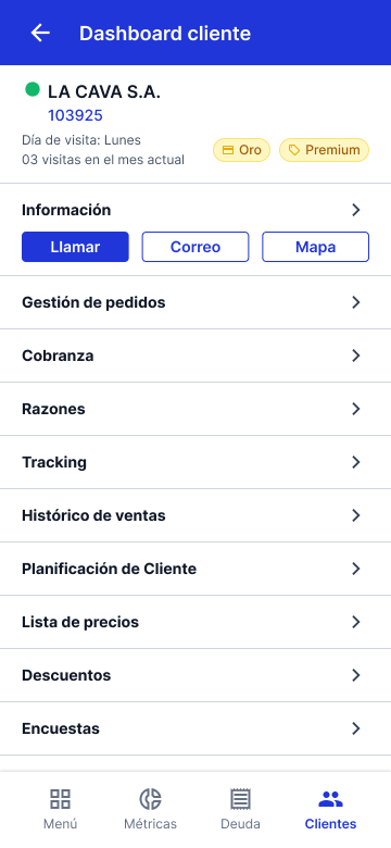
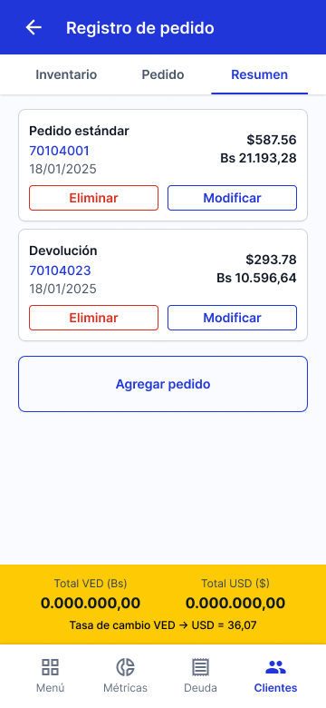
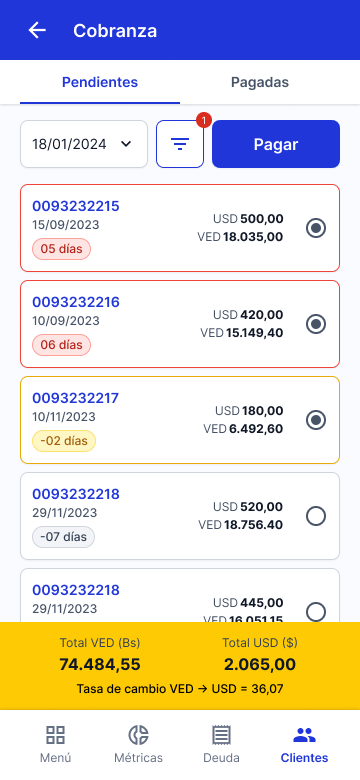
- A centralized customer visit view, grouping all relevant actions (orders, billing, inventory checks, and visit outcomes) in one place.
- Centralized Debt Management and Stock dashboards to help salespeople monitor targets and plan daily activities more efficiently.
Crafting the Interface
Setting the foundations
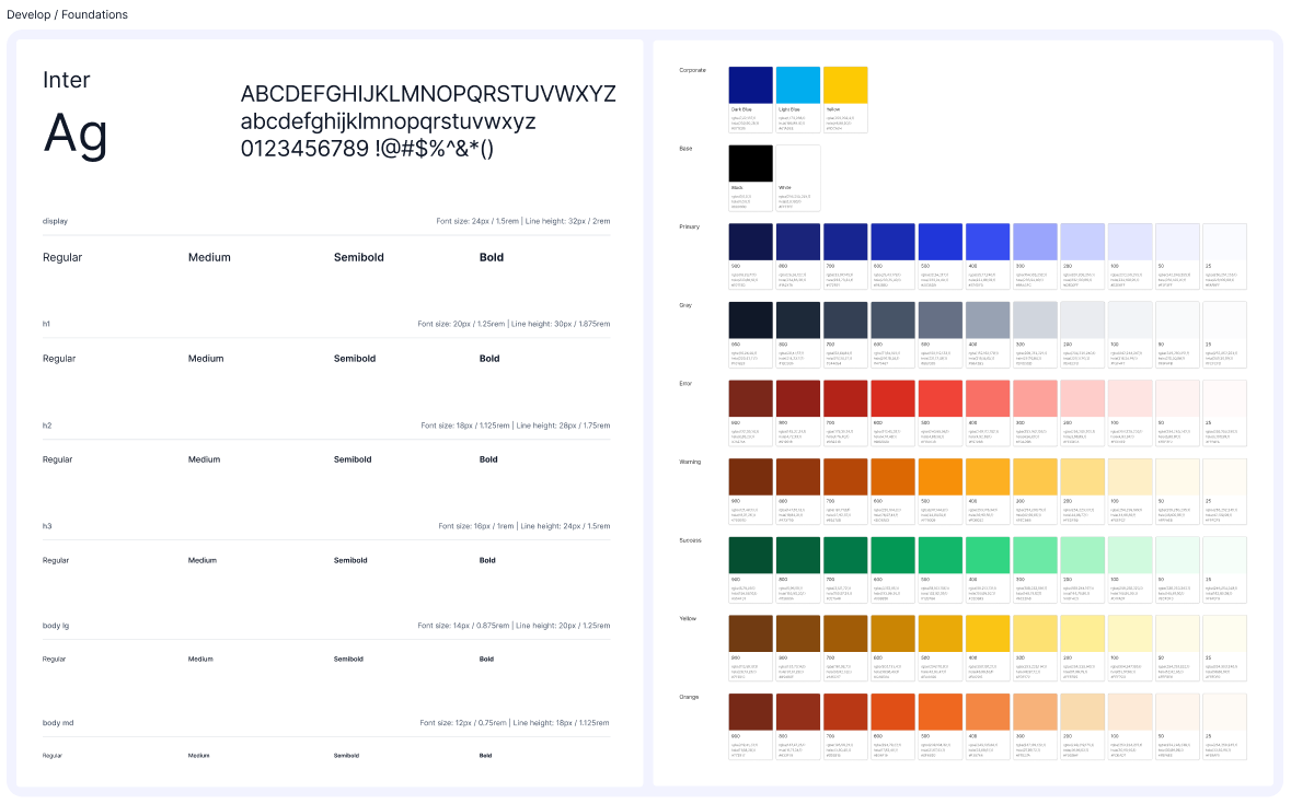
I chose Inter as the primary typeface due to its wide range of weights and styles, strong language support, and excellent readability at all sizes. It also offered the advantage of being free to use, avoiding additional costs for the company.
For the color palette, I used the brand’s existing blue as a starting point for the primary color, then adjusted its tone to contrast range keeping accessibility in mind.
Finally, I selected Material Icons for their extensive library and variety of styles, which allowed for consistency and flexibility throughout the interface.
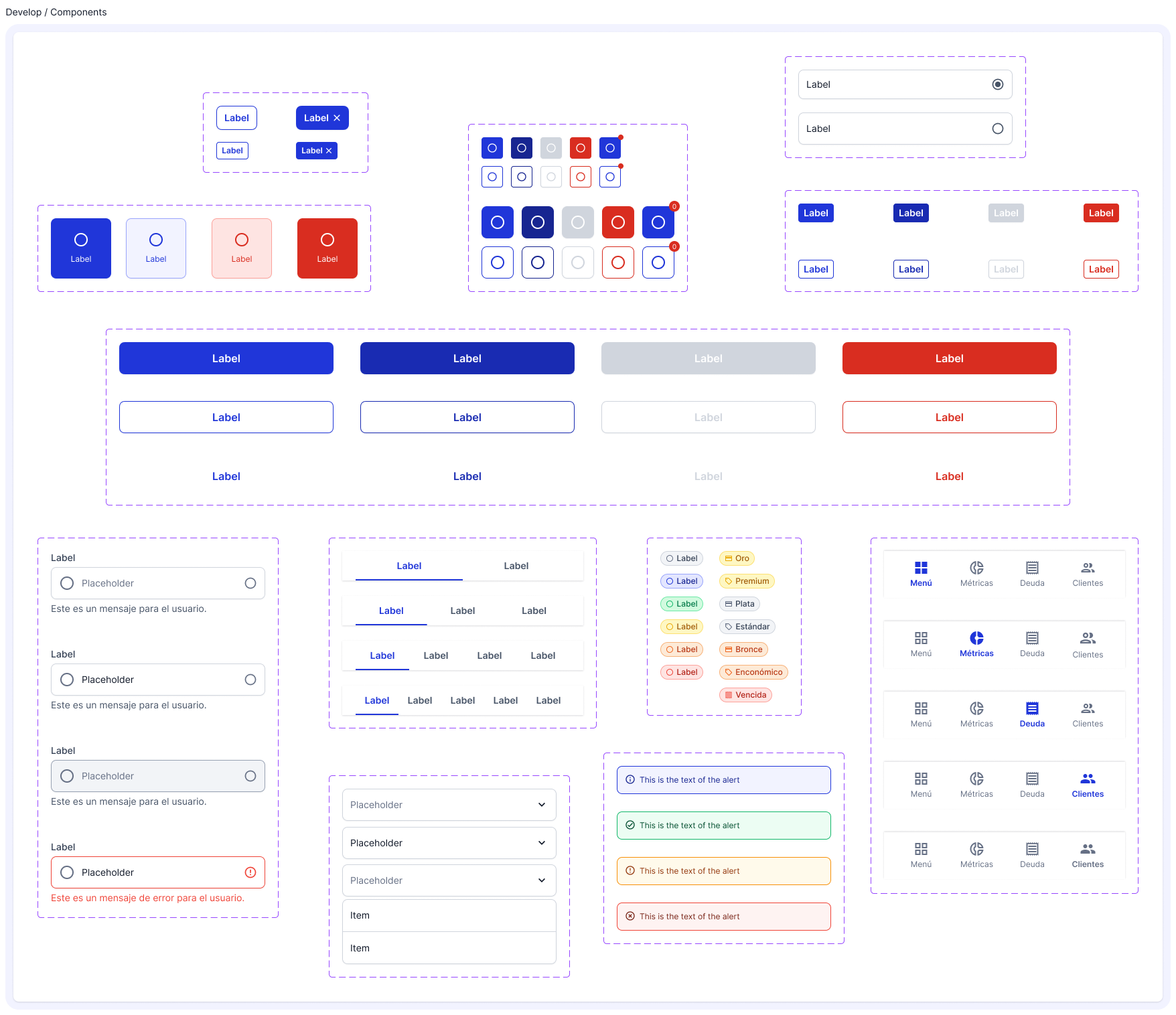
Assembling the components
Having the workflows mapped, I proceeded to start developing the components that evolved and expanded eventually turning into the platform’s Design System.
Developing a consistent language
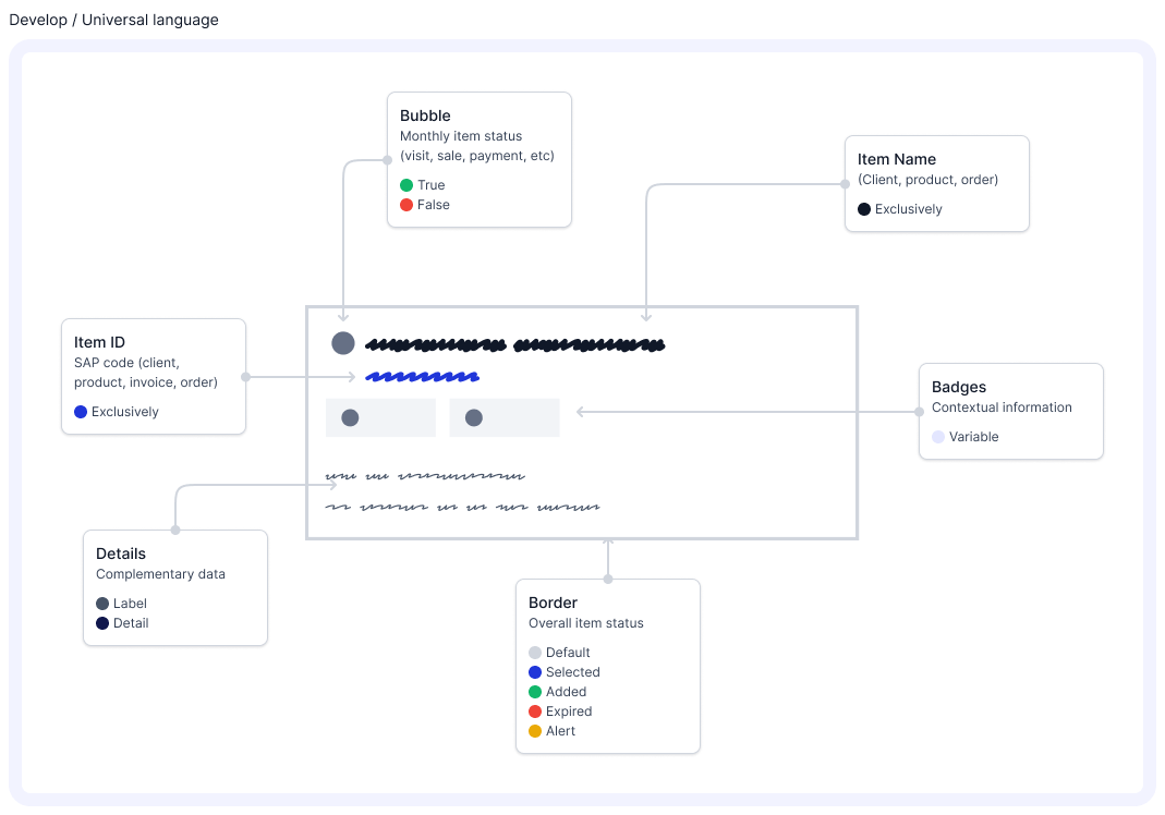
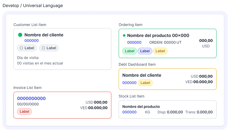
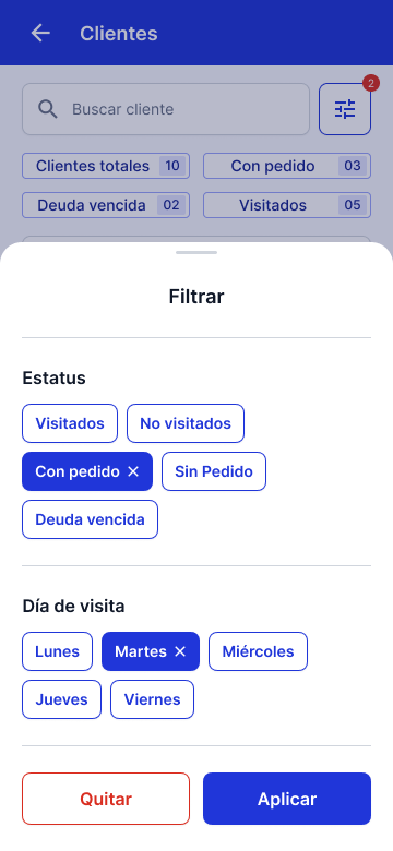
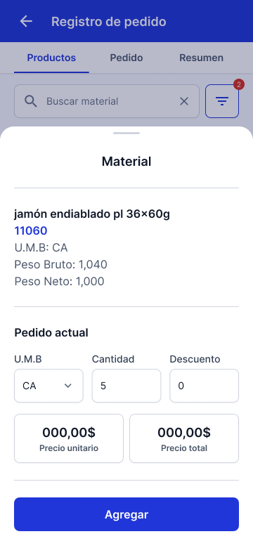
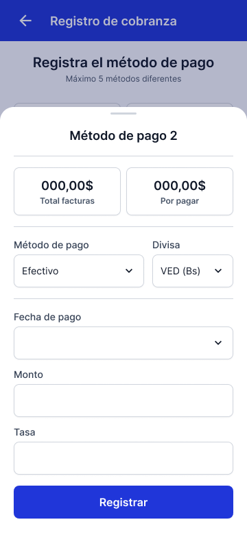
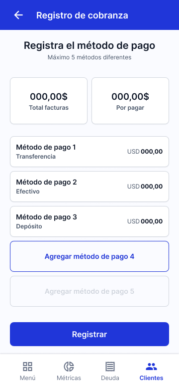
Given the complexity and volume of information—especially within item cards—I needed to design a clear, consistent visual language that could be easily recognized and understood across different workflows. This included:
- Reducing reliance on user memory (recall) by surfacing relevant information contextually and visually.
- Establishing a visual system of icons and labels that could scale across modules without requiring repeated learning.
- Streamlining the information hierarchy to highlight essential details and minimize distractions.
Building the solution
With all the building blocks and parameters in place, I proceeded to design the different workflows of the application. Expanding on what had already been stablished while keeping patterns and consistency at the center of the development.


Phase 4: Deliver
Application Development
As of July 2025, approximately 80% of the MVP’s core features have been developed. However, due to an internal company restructuring, integration with the SAP infrastructure has been significantly delayed and has been on hold for over three months. Despite this setback, the application is still expected to begin testing in selected sales routes by the end of Q4 2025.
User Testing
Prior to the project being temporarily paused, early user testing using a Figma prototype yielded promising results. Test participants were able to navigate the core workflows of order processing and debt collection with relative ease. Feedback collected highlighted minor issues related to terminology and task prioritization, which are being addressed ahead of the MVP rollout.
Contact me!
Redesigning a legacy sales tool
Role
UX/UI Designer
Methodology
Double Diamond
Timing
One year
The FDV App is a mobile sales management tool designed for Plumrose Latinoamericana’s national sales team in Venezuela. It streamlines key sales operations such as order processing, collections, and inventory tracking, enabling sales representatives to provide more efficient and tailored service to their clients while meeting business targets.
The project emerged from two main challenges: the limitations of an externally managed legacy system that hindered product improvements, and an imminent change in the vendor’s pricing model that would significantly increase operational costs starting in 2025.
My role of Lead Designer in this project as a service provider working attached to the IT Department.
How do you redesign a legacy sales tool to improve performance and reduce long-term costs?
Phase 1: Discover
Stakeholder Interviews
We started by interviewing the stakeholders to kickoff the data gathering.
Miguel García
Our internal client, Miguel provided insight into the business motivations behind the project. The goal was to clarify why a new solution was needed, what limitations existed in the current tool, and what success would look like from a commercial perspective.
Key quotes:
“The team is constantly complaining about how unnecessary redundancy makes using the app time-consuming.”
“The order error-associated cost we are having with our current solution is too high.”
José Cuevas
As both IT lead and Product Manager, José outlined the functional requirements of the new solution and the technical constraints we needed to work within. He also coordinated user research activities and served as our main liaison with the internal teams.
Key quotes:
“We need something developed in close collaboration with our team to make it easier to keep improving down the line.”
“The current app has been built piece by piece over six years, but it stayed a module-based system—which now is a hindrance.”
Gregory Pestana
Gregory, responsible for SAP integrations, helped us understand the technical architecture and the non-negotiables in terms of system compatibility. His input shaped how we scoped the redesign while minimizing disruption to the existing infrastructure.
Key quotes:
“The SAP integration infrastructure is where most of the time has been invested—we have to keep as much of it as possible in place.”
“One of the main problems is that decisions have been made at a business level without taking the final user’s feedback into account.”
With this initial information I coordinated a Shadowing exercise with the users.
Shadowing
Supported by the local IT team, we shadowed three members of the sales team during a regular workday. With minimal intervention—only asking questions when we sensed frustration—we aimed to uncover pain points in the current application and understand how these issues affected the quality of service they provided to customers.
User survey
To validate our initial research findings and better understand pain points at scale, we conducted a survey of all 153 members of the national sales team.
Lastly I conducted an Heuristic Evaluation of the tool to identify specific areas to improve.
Heuristic Evaluation
The following usability issues were identified through a heuristic evaluation of the existing application:
Phase 2: Define
Insights
I gathered all the information the team collected over the Discover phase and distilled to the insights we used as a guide moving forward.
Designing around existing SAP infrastructure
One of the most critical constraints uncovered during stakeholder interviews was the need to preserve the existing SAP-based back-end. To avoid major disruptions and reduce development time, the new application had to integrate seamlessly with the current infrastructure—limiting how much we could alter the underlying architecture.
We prioritized redesigning only the most essential modules for the first iteration of the product. These core features formed the scope of a fully integrated MVP:
Redundant Navigation and Workflow Interruptions
Through user observation and interviews, we identified a major friction point: the current app forces users to restart tasks or repeat actions when switching between modules, severely disrupting workflow continuity. This not only increases cognitive load but also leads to errors and inefficiencies in the field.
Poor Data Visibility and Inconsistent System Feedback
The existing user interface lacks clear feedback mechanisms, offers limited visibility into critical data (such as stock availability), and depends heavily on ambiguous iconography. These issues, combined with a cluttered layout and weak visual hierarchy, lead to preventable errors, slower task completion, and reduced user confidence.
Phase 3: Develop
With the project’s scope and challenges clearly defined, I moved on to developing the core building blocks of the new application.
Sitemap
To address the workflow and navigation issues, I redesigned the app’s information architecture based on the two primary usage contexts identified earlier—planning/tracking and customer-facing interactions. The goal was to consolidate related features into unified flows, reducing the need to jump between modules. Key changes included:
- A centralized customer visit view, grouping all relevant actions (orders, billing, inventory checks, and visit outcomes) in one place.
- Centralized Debt Management and Stock dashboards to help salespeople monitor targets and plan daily activities more efficiently.
Crafting the Interface
Setting the foundations
I chose Inter as the primary typeface due to its wide range of weights and styles, strong language support, and excellent readability at all sizes. It also offered the advantage of being free to use, avoiding additional costs for the company.
For the color palette, I used the brand’s existing blue as a starting point for the primary color, then adjusted its tone to contrast range keeping accessibility in mind.
Finally, I selected Material Icons for their extensive library and variety of styles, which allowed for consistency and flexibility throughout the interface.
Assembling the components
Having the workflows mapped, I proceeded to start developing the components that evolved and expanded eventually turning into the platform’s Design System.
Developing a consistent language
Given the complexity and volume of information—especially within item cards—I needed to design a clear, consistent visual language that could be easily recognized and understood across different workflows. This included:
- Reducing reliance on user memory (recall) by surfacing relevant information contextually and visually.
- Establishing a visual system of icons and labels that could scale across modules without requiring repeated learning.
- Streamlining the information hierarchy to highlight essential details and minimize distractions.
Building the solution
With all the building blocks and parameters in place, I proceeded to design the different workflows of the application. Expanding on what had already been stablished while keeping patterns and consistency at the center of the development.
Phase 4: Deliver
Application Development
As of July 2025, approximately 80% of the MVP’s core features have been developed. However, due to an internal company restructuring, integration with the SAP infrastructure has been significantly delayed and has been on hold for over three months. Despite this setback, the application is still expected to begin testing in selected sales routes by the end of Q4 2025.
User Testing
Prior to the project being temporarily paused, early user testing using a Figma prototype yielded promising results. Test participants were able to navigate the core workflows of order processing and debt collection with relative ease. Feedback collected highlighted minor issues related to terminology and task prioritization, which are being addressed ahead of the MVP rollout.